Visualization of inter-firm transaction network on Digital Earth
2017.7
Data visualization is one way to intuitively show the complex relationships that underlie inter-firm transactions data. In collaboration with Tokyo Metropolitan University, we have developed a method to visualize the inter-firm relationships on a 3D digital earth. This has paved the way for users to visually grasp the structure of the inter-firm transactions that transcending geographic boundaries, without analyzing the complex data.
Limitations of 2D visualization and a case for 3D methods
Inter-firm transactions can be regarded as network with companies as the nodes and transactions as the edges. A simple business relationship is shown in the diagram below, with the two shaded circles representing the companies (nodes) and the arrow representing the transaction (edge). In reality, the number of transaction partners are numerous making the network structure of nodes and edges very complicated. However, with the use of 3D visualization methods, the data can be plotted on a 3D scale, enabling users to get a better understanding of the relationship and hierarchy of inter-firm transactions.
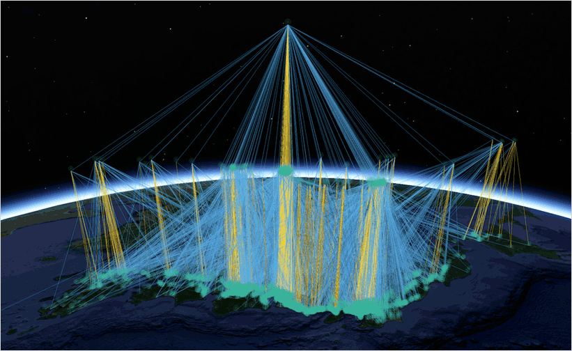
An application of 3D visualization
Drawing on Teikoku Databank’s inter-firm transactions data, the diagram below shows the 3D transactions network of a finished car maker. At the peak of the network is the finished car maker. The points that lie below represent the hierarchy of its trading structure i.e. primary subcontractor, secondary subcontractor etc. The different altitudes at which the nodes (trading partner) are plotted gives useful insights into the supply chain structure of the finished car maker. By representing the nodes as translucent points and the density of trading partners as shades of overlapping points, it is possible to grasp the accumulation of supporting industries in different regions. Furthermore, by representing the transactions with trading partners who are in the same area, with a certain color and the transactions with those outside the region with a different color, it is possible to get visual insights on the extent which the finished car maker and its trading partners are contributing to their local region. The weight of the lines represent transaction volume and it is evident from the diagram, that transactions are dense in the Tokai region and in the vicinity of big cities where the automobile industry gathers. On the other hand, transactions are relatively sparse in the Shikoku region and the in areas south of Kyushu.

※Based on test data created for R&D purposes
From the above example, it is evident that 3D data methods are particularly useful in representing inter-firm transactions data. The complex information can be condensed into an easy to understand graphics, enabling users to get a better understanding of the transaction structure and geographic dispersion of a supply chain.
Tokyo Metropolitan University Tokyo Watanave Hidenori Industry Research Division
Advanced Data Analysis Services Division Kohei Arimoto
Big Data Analytics TOP